Feeds:
Posts
Comments

Posts Tagged ‘color’

After a 10 month hiatus, it is time to focus on pattern, color, design and of course, a bit of whimsy now and then.

Why wait for the whimsy when Dolce & Gabbana provides us with a riot of color and pattern in the Queen of Hearts Collection.  For more from this collection, look no further than the Elle online review of the Spring 2018 show.

Read Full Post »


stuart davis

Recently, the Wall Street Journal’s Art Review featured a mural by Stuart Davis. “Swing Landscape”, one of a series of murals commissioned by the WPA, features the docks, houses and landscapes of Gloucester, Mass. “At some 7 by 14 feet, it explodes at us. The art historian Meyer Schapiro likened it to a “brass band.” It immediately established Davis as one of the most powerful of modern colorists.”

Stuart is considered “one of the century’s most accomplished muralists. And “Swing Landscape” (1938) is surely one of the greatest paintings of modern American art, a glorious summation of all Davis had been and was still to be.”

Read Full Post »

GuilioMenossi_Primavera_La_Luminosa_via_del_cuoreAfter many years of working with bits of glass, Giulio Menossi is still playing with heart and spirit. “His ouevre is characterized by elegant, sweeping structural arcs always emblazoned with color, color, color.  There is a joie de vivre and playfulness here derived from slashes of color that look like they could have been made by crayons and his completely uncensored use of materials.  Lego pieces snuggle up to pearls; smalti and marble provide the background for a bunch of twigs.  What life!  What fun!”

primaveradetail

In this article from Mosaic Art Now, he describes his journey and what inspires him.

Read Full Post »

gucci-editedYikes!!! It has been almost two months since my last post. My excuse…well, travel, working at and for the Co-Op and…procrastination!!!

As an amends, I found the perfect ‘back to work’ featured photo. It doesn’t get any better than ants, snakes, butterflies, lady bugs and beetles on silk organdy. We can thank Gucci for this amazing combination. Scroll through the whole Pre-Fall 2016 collection for more ‘interesting’ design inspiration.

Read Full Post »

prestige arts

While flipping through the pages of the High Point Accessories Preview book, metallics appear to be ‘THE’ surface for Spring 2016. I apologize for the quality of the photos. Most of the items are new and the items have not been published online.

The feature photo is an oil from Prestige Art. The reflective nature of the gold veining is not apparent in this photo, but I see translating design into a marbled polymer surface or even mokume gane. Love the tonal effect of the grays in contrast to the gold.

flow decorThe trio of lamps from Flowdecor, features the metallics in a traditional greek key columnar shape, a sleek contemporary paired with acrylic and a glass & textural base.

Gold appears to dominate the metallic landscape this year, followed by bronze and then silver.

Read Full Post »

legacy linen_editedThe next few posts will feature the colors, textures & trends from the Spring 2016 High Point Furniture Market. The preview books arrived yesterday and after a quick perusal, it appears this deep blue is ‘THE’ color. How to describe it…HMMM!!! The deeper blues in this beautiful agate are close, as is the background color of blueprints.

agate-stone-blue


Read Full Post »

sarah bagshawSarah Bagshaw’s work is informed by artists and designers working in a wide range of disciplines. That description applies to the underlying design process of many artists. We collect, study and ponder the world around us and then transform or translate those insights. Sarah Bagshawmakes one-off pattern designs using handmade processes (drawing, painting, printmaking, photography and collage) combined with Photoshop. I use Photoshop in an experimental manner and love ‘happy accidents’.”

Read Full Post »

pantone fall 2016

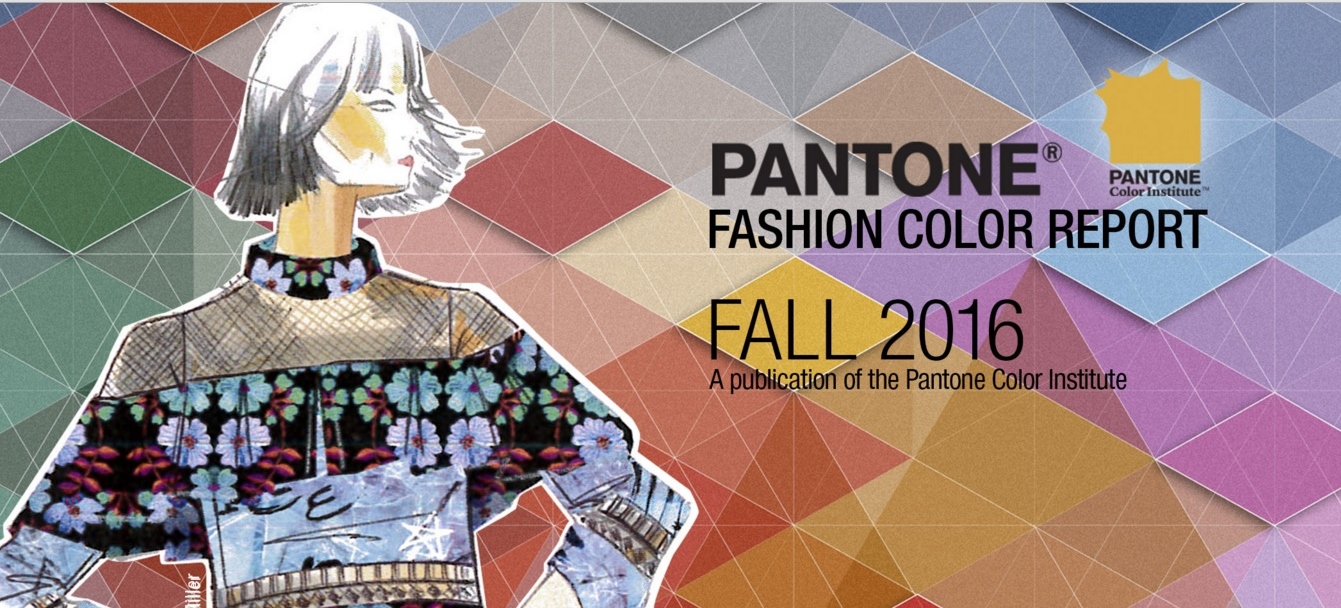
It isn’t even Spring and I am already looking forward to Fall…at least the Pantone colors of Fall 2016. As you may know, I was not very excited by the Colors of 2016, Serenity & Rose Quartz.

From Leatrice Eiseman, Executive Director of the Pantone Color Institute: The desire for tranquility, strength, and optimism have inspired a Fall 2016 color palette that is led by the Blue family.

Along with anchoring earth tones, exuberant pops of vibrant colors also appear throughout the collections. Transcending gender, these unexpectedly vivacious colors in our Fall 2016 palette act as playful but structured departures from your more typical fall shades.

Blue skies represent constancy as they are always above us. Grays give a feeling of stability, Red tones invite confidence and warmth, while the hot Pinkish Purples and Spicy Mustard Yellows suggest a touch of the exotic.

My next project, translating these colors into the Kato color pallette.


Read Full Post »

salvatore-ferragamo

According to the March 2016 Town & Country, stripes were the dominant pattern in Spring Collections. This Salvatore Ferragamo Aileen purse is already a best seller…and Spring is a month away.  BTW…more stripes in a chevron pattern on the Ferragamo home page.

Read Full Post »

ncrocksThe Mother-Daughter team of Nadine Hammoud and Cherine Altobaishi design jewelry that is inspired by their Lebanese heritage and their travels to exotic locales. Timeless in style and modern in expression, NC Rocks creations recall the abstract musings of artists like Al Held and Pablo Picasso, Wassily Kandinsky and Piet Mondrian. They honor the stylized ornamentation of art deco, the contoured fashions of the 30s and 50s, and the liberal, versatile vibe of the 70s.

My New Years resolution to post on a timely basis was foiled by technology…our internet connection evaporated on New Years day and did not return until today.

Read Full Post »

Older Posts »