The focus of Ornamental Elements is moving from featuring the work of multiple artists to featuring work in process in my studio on Instagram.
In addition, the latest work of over 40 amazing artists in the Charleston Crafts Gallery is featured monthly in the Charleston Crafts Co-Op Gallery Blog.
After a 10 month hiatus, it is time to focus on pattern, color, design and of course, a bit of whimsy now and then.
Why wait for the whimsy when Dolce & Gabbana provides us with a riot of color and pattern in the Queen of Hearts Collection. For more from this collection, look no further than the Elle online review of the Spring 2018 show.
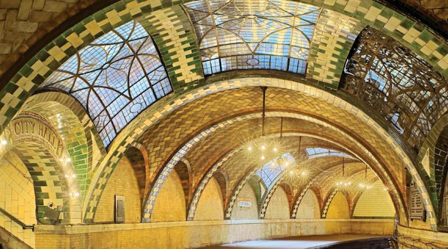
On a recent trip to the Biltmore Estate, I noticed the amazing tile work ofRafael Guastavino. Little did I realize his work covers some of the mosticonic public spacesin the United States. “The Guastavino family’s soaring tile vaults grace many of the nation’s most iconic structures including Grand Central Terminal, the Cathedral of St. John the Divine, the Boston Public Library, the U.S. Supreme Court, and the Nebraska State Capitol.”
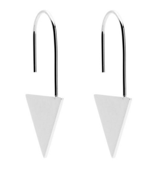
These sleek earrings from Australian designer Amber Sceats start our year with a timeless design element…the triangle. Amber’s designs are “Heavily influenced by her appreciation for art, travel and architecture; Amber Sceats is an ode to the abstract. The underlying ‘rock’ element throughout her collections make the pieces uncompromisingly contemporary whilst simultaneously timeless.”
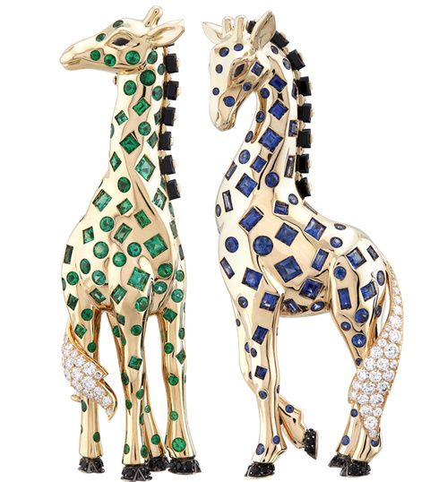
There is something about the holiday season, that brings out the inner child in all ages. Van Cleef & Arpels’ animal clip collection for 2016 will be certain to bring a smile to your face. “With its glittering procession of animals, the Maison’s new High Jewelry collection takes an affectionate look at the tale of Noah’s Ark. These giraffes are up to their necks in emeralds and sapphires, offering a spectacular tribute to the wonders of the animal kingdom.”
Don’t forget to click on the‘Historic Collection’ at the bottom of the page for more look back at some earlier pieces…love the lion and the cat!!!
“With an eye that favored strict geometric shapes, Josef Hoffmann was in many ways anticipatory of the cubist movement. His fondness for the square was so well-known that the architect and designer earned the nickname Quadrati-Hoffmann (Square Hoffman) among his peers.
Hoffmann was among the rare breed of designers who could make anything. Coming to prominence at the turn of the 20th century, the Austrian creative put his mark on everything from lounge chairs and silverware to a modernist sanatorium. Hoffmann undoubtedly owed much of his success to good company—working alongside artists like Koloman Moser and Gustav Klimt, the young Hoffmann founded the Vienna Secession, an organization of artists that held exhibitions of progressive work as a reaction to the prevailing conservatism of the art world.”
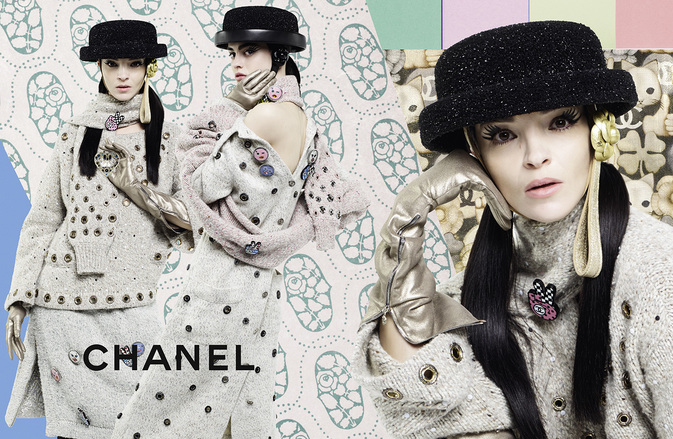
The September fashion magazines are stacked in my studio with pages ripped out for scanning or dog eared for future reference. During a quick page through of Elle, I discovered that even the august house of Chanel has a playful side. The photo from the Fall 2016 collection features three designs with colorful resin emoji brooches scattered throughout. Another dominant element that appears frequently in designs this fall is the use of grommets.
More ‘notes’ in later posts as I work my way through the stack. Hmmm!!! I love this homework!!!
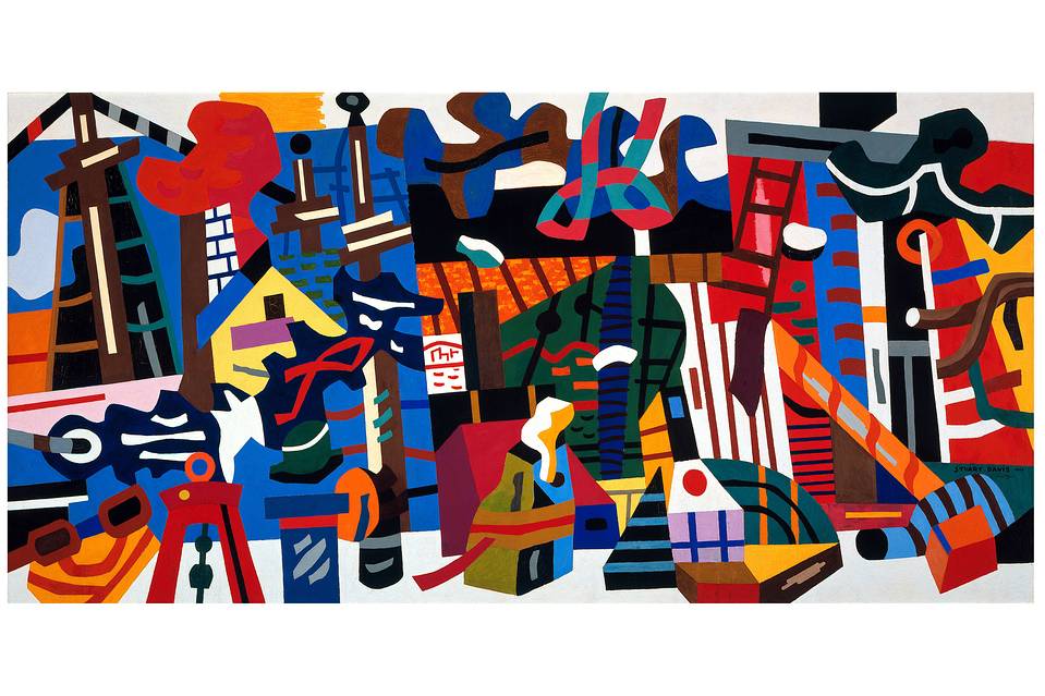
Recently, the Wall Street Journal’s Art Review featured a mural by Stuart Davis. “Swing Landscape”, one of a series of murals commissioned by the WPA, features the docks, houses and landscapes of Gloucester, Mass. “At some 7 by 14 feet, it explodes at us. The art historian Meyer Schapiro likened it to a “brass band.” It immediately established Davis as one of the most powerful of modern colorists.”
Stuart is considered “one of the century’s most accomplished muralists. And “Swing Landscape” (1938) is surely one of the greatest paintings of modern American art, a glorious summation of all Davis had been and was still to be.”
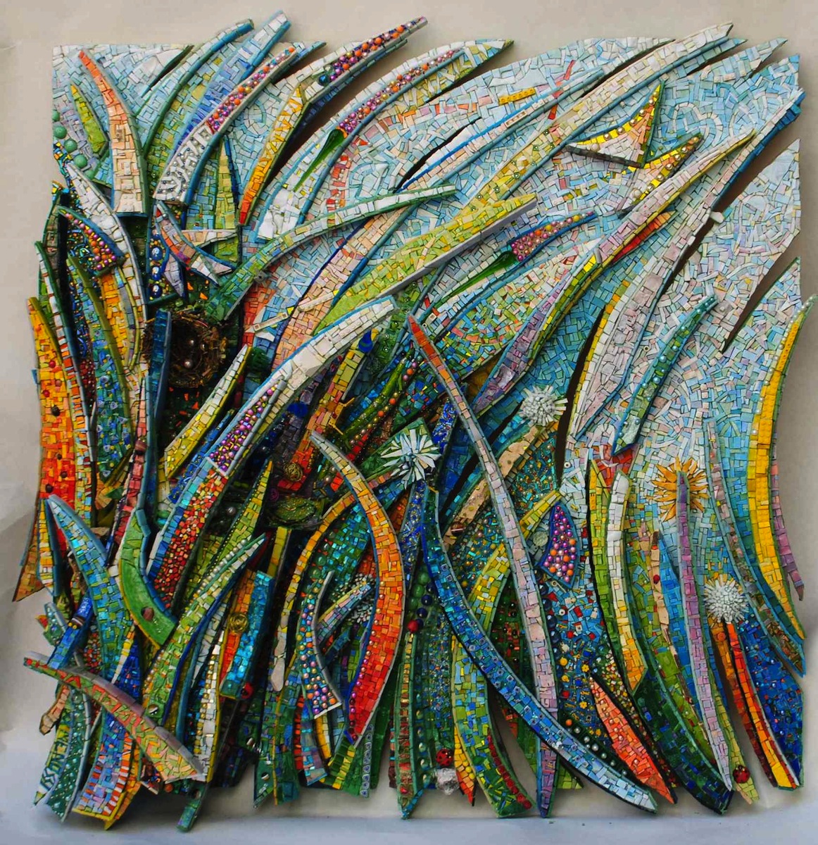
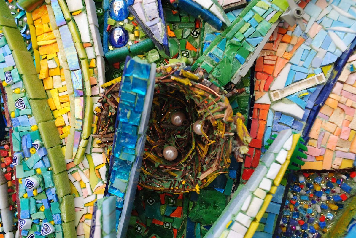
After many years of working with bits of glass, Giulio Menossi is still playing with heart and spirit. “His ouevre is characterized by elegant, sweeping structural arcs always emblazoned with color, color, color. There is a joie de vivre and playfulness here derived from slashes of color that look like they could have been made by crayons and his completely uncensored use of materials. Lego pieces snuggle up to pearls; smalti and marble provide the background for a bunch of twigs. What life! What fun!”
In this article from Mosaic Art Now, he describes his journey and what inspires him.
 The focus of Ornamental Elements is moving from featuring the work of multiple artists to featuring work in process in my studio on Instagram.